"Evil" (2013) GAME REVIEW
- Sep 25, 2022
- 6 min read
Updated: Sep 26, 2022

The early 2010s seemed to mark the golden age of indie games, with successful titles such as Five Nights at Freddy’s and Undertale. Though, with all of the hype about these new works and urban legends such as Slenderman or Jeff the Killer circulating throughout the web, countless beginner developers and independent designers attempted to jump on the horror bandwagon and make the next big indie game.
I first heard of the game “Evil” upon its release in 2013. The game was in beta phase, with very few people having actually been aware of its existence. It gained some popularity through gameplay from YouTube icon Markiplier, but otherwise faded into the backdrop with other interactive conglomerates of trending horror elements.
However, with all of its obscurity and mystery surrounding it, did Evil truly deserve the fate it received? Did it earn a spot on the shelf of forgotten horror works?
Absolutely.
To say that this game is a total mess would be an understatement. The graphics, audio, pacing, gameplay, and plot are some of the worst I have ever seen. I have decided to organize my reviews with a ranking system utilizing the above categories. Each will elaborate on details that stood out to me about the game.
Check out this fun YouTube “Review”:
Graphics: 1/10

The graphics in this game are horrible. Nameless, the creator of the game, emphasized that anyone playing should prioritize the graphics above performance, which ended up squandering both. Though I have some sympathy due to the early Unity platform being used to create the game, I will not excuse the sad quality of the visual elements. At each beginning “level”, we are greeted by the main character waking up in their room. The design of the walls, the cabinet, the desk, and the window that make up the setting are uncomfortable, and not in a good way.
Once you get past the beginning scene, you are greeted to absolutely nothing but a door. It shares similarities to the beginning Cry of Fear in a sense, but differs in that Cry of Fear actually offered a mechanic that worked with the blank environment with the introduction of a camera flash to find a door. In this case, the only thing the player can do is go forward until they wake up back in that terribly constructed room.

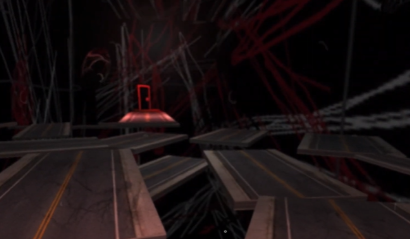
The most notorious levels, however, are the ones that look like a child had scribbled on them using MS Paint. Decals are spread across the walls on certain maps to give this randomized and messy appearance, but they fail to convey any sense of fear and rather provide a lazy outlet to appear “different” from other games. There are also faces splattered across the backdrops of some maps, but those only served to make me confused.
The visuals in this game are haphazardly slapped together and focus more on “randomness” than building atmosphere, making the game feel more like the fever dream of an edgy 14-year-old from 2013 than anything that actually screams “horror”.
Audio - 1/10
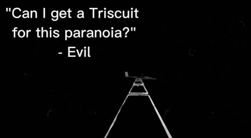
The audio in this game annoyed me to no end. The game begins with a quote from who I can only assume is the main character, but rather than there being a voice actor, the creator decided to implement a rather monotonous text-to-speech bot to read out the words. The only reason I drew comparisons between the protagonist of the game and the quote reader was because, yet again, the text-to-speech bot was used when the main character says: “now I am ready to go”. Otherwise, the only other thing the protagonist says (which is the only thing that sounds even remotely human) is “8:30” in a rather tired voice after hitting the alarm beside his bed, which doesn’t even match the 7:30 display on the clock.
When entering what can only be described as the “dream sequence”, my ears were punished by the static and crunching sound that filled the entire map. The noise was enough to give me a headache, but again failed as a proper scare tactic. Most of the audio in the game could only be described as “crunchy”, and at one point I could make out reused audio from other levels. There is a set of dialogue within the game where very little can be heard clearly, leading to a rather humorous mistake in translation.

Pacing - 1/10
Moving from one level to another was absolute torture. The protagonist moved at the speed of a crawl, and jumping did not help. Combined with the lack of details in many of the levels, most of the time I was stuck pressing the “W” key for a solid minute and a half just to get to the next segment of the game surrounded by either complete darkness or a large room covered in red and white scribbles. The only reason I did not immediately give up on moving to the next level was because I found that, if I simply clicked the door on the far end of the level, I could advance to the next level without even having to physically move the character.
Gameplay - 1/10
The gameplay is hilariously bad, with glitches and mistakes galore. I found that the starting animation of the protagonist shutting off his alarm could be triggered by clicking, and clicking multiple times could restart the animation regardless of how complete it was. This could lead to the opening animation beginning as many times as the player desires.

As mentioned before under the pacing section, the protagonist walks insanely slow, making for an all out boring experience getting between levels. Attempting to jump did not make the character move any faster than he already was, and the lengths between levels were spread too far out to invoke a sense of fear in the player after initially taking in the scene.
The worst level in this entire game has to be the street level. One section of the game involves the protagonist jumping across slabs that look like roads. Cubes hover above the player and the walls are covered with the signature scribbles. Jumping from plank to plank in this level was impossible. The protagonist could not jump high enough to get over any curbs, and I ended up falling several times attempting to get to the door at the far end. I don’t know how anyone could have possibly gotten past that level organically, and the only reason I got past it at all was by complete accident. After spending a solid ten minutes trying to find a way past this excruciating level, I accidentally clicked the door at the far end and was transported to the next level.
After getting through the street level, I discovered that the protagonist didn’t even need to walk to get through each level, and instead could click through each door and be automatically transported.
Toward the end of the game, I encountered a level where I was on a single platform with a button. I tested the limits of the platform, only to softlock myself in the level with no way of even clicking to move on. In the end, I was forced to exit the game and restart it.
Plot - 1/10
There is really no plot. The creator of the game only had this to say for any indication of one:
“Your temptation won you. He attracted you to his mind. There's no escape. You're not sure what to do. You don't find a way out. You have to fight to your fears, to your hell, to the evil itself and... to the evil's fears. Suffer, discover, fear, survive... don't lose your head.” - Nameless
What does this mean? I couldn’t tell you. The game seems to only hold a fraction of plot. The game wasn’t scary, so fear is out of the question. Nothing in the game actually kills or harms the protagonist (other than the protagonist hitting a television while falling), so there’s no real incentive to survive. I suppose the only two pieces that are actually offered in the game are that of discovery and suffering. I certainly discovered plenty of random thrown together tropes and suffered poor gameplay mechanics and audio crunching.

Final Rating - 1/10
This game is at the least an experiment conducted by someone willing to try out the Unity platform and at the most a painful walking simulator testing the patience of its players. The game borders on the line of parody—especially regarding the inclusion of Slenderman—but it doesn’t stretch far enough into humorous territory to come across as that. The game relies on the confusion offered by the landscape to entertain the player, but fails to deliver on any fear factor. Anything remotely scary within the game is a popularized trope from 2010 or a very cheap jumpscare.
Personally, I feel like this game was an attempt at game development from a complete beginner and advertised before being properly edited. While viewing it from this perspective can offer an explanation for the poor construction of the game, it cannot necessarily excuse the content of it. What is even more interesting about this game is that it is labeled as a “first person shooter” despite no weapon being found within it.


Comments